Posts

PSA: Draft 1

Image
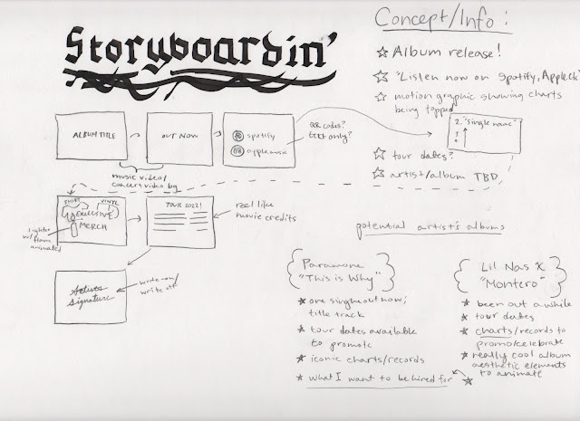
 Here's what I have so far for the PSA. I've been struggling with my senior studio exhibition and a separate screenprinting project so my time has been stretched pretty thin lately, but I'm equally excited to see how this PSA turns out. I wanted to do this project to act as an "updated PSA' for the Alamo's current reel, just so I can see how my aesthetics look compared to a large company. I haven't added any aesthetic elements yet though... but that's the work I'll be diving into this week! I also only have the compositions blocked off in this draft, so I will probably start with the transitions between compositions sliding in and out and flipping out of view like papers, similar to the order cards they use in their theaters.

PSA: Tutorial

Image
      My tutorial for the PSA was a paper tear texture effect. I still haven't figured out how to replicate the effect into my own project file, but I have uploaded a photo of what I have so far. I sent the file to Ed and he made a file of his own to test the tutorial, which was really helpful to get a file that was fully working so I could reference the pre compositions and their settings. I still really want to use the paper tear in my project, but I've moved on to just start placing my frames in and I'll go back afterwards to add in the tear somewhere probably at the end to reveal the company's logo.  

PSA: Storyboard

 I've been trying to plan these projects to create examples of motion graphics that I would be interested in getting hired for. Since 2017, I have had a slight obsession with the Alamo Drafthouse Cinema when they opened a Raleigh location. I have always enjoyed going to the movies and it was even my first job bagging popcorn at a shitty Marquee Cinemas. What I loved most about the Alamo experience is their pre-movie screenings that are designed specifically for the movie you're about to see. Sometimes, they'll even get one of the actors to create the PSAs before the movie to encourage attendees to be follow the theater's rules. The Alamo's most famous rule is they're very strict on talking and texting; after one warning, you will be removed from the theater with no refund! (My most favorite rule is they don't allow kids in showings past 8pm). I wanted to use this PSA assignment to make a no-talk-no-text PSA for the Alamo, in their classic style, and maybe wi...

Info Final!

Image
 My final version of the infographic! Really loved working with transitions on this one, but it rendered really fast? Not sure if that was a miscalculation on my part but it still feels really consistent at least.

Info: Effect Tutorial

Image
     Since my motion graphic for the informational project is focused on text detailing the artist's album name, release date, and tour dates, I wanted to find good effects for text animation that are still easy to read. I specifically tried to find an animation for a line of text rising to the top of the charts, as well as a reel of text to detail a list of concert dates.       I have uploaded my current use of a rain effect for the introduction to my informational, and have linked the tutorial I used in this post as well as the description of my YouTube video! The artist's album cover features a rain drop effect so I wanted to incorporate that into an animated version.

Info Storyboard

Image
     My initial idea for our third project, an informational, is a video to promote the release of an album and its stats on the top album/singles charts. This came to mind because music is one of the fields I hope to be hired for when I'm a graphic artist full-time. Musicians often have motion graphics in their advertisements to announce a new single or album, and I want to be able to experiment with this concept now so I can build the skillset on animating a poster and making typography really lively with motion graphics. I have yet to decide what artist or album to use, but both albums I've thought of have really distinct aesthetics that I could enhance in my video animations. 

FINAL: Personal Interstitial

Image